Sarratt Rebels FC: a club site that matches the strip

Sarratt Rebels already had a crest, a motto, and a WordPress.com page. Parents landing there saw a red “INFO” button and a three-link menu. The club needed a site that looked like match day — and that could take a family from “who are you?” to “join us.”
The club
Sarratt Rebels Youth FC is a non-profit, FA-accredited grassroots club in Sarratt, Hertfordshire. They play at King George V Playing Fields, share colours with the adult side Sarratt FC, and compete in the West Herts Youth League. Ages run from under-8s through to under-18s. The motto on the crest is Per Unitatem Vis — through unity, strength.
All money raised goes back to the children. Coaches are DBS checked; most hold FA Level 1 and 2. Welfare sits at the centre of the club, not as an afterthought. The website had to say that without looking like a default WordPress theme with a crest pasted on top.
The challenge
The old homepage was a WordPress.com brochure: logo, serif title, Home / Welfare / Join / Contact, one hero, one “INFO” button. Recruiting for 2026/27 — a full U8 side, a full U15, a couple of U18s — lived in a block of email addresses. There was no teams page, no fixtures, no news, no gallery. A parent could not see the club as a club.
- • Use the strip — black, yellow, the crest — instead of a generic red-and-white theme
- • Make Join Us a primary action, not a buried page next to Welfare
- • Give the club room for teams, fixtures, news and a gallery
- • Keep it a community club: developing players, friendships, and the village
Before and after
The old site hosted a club. The new one presents one.
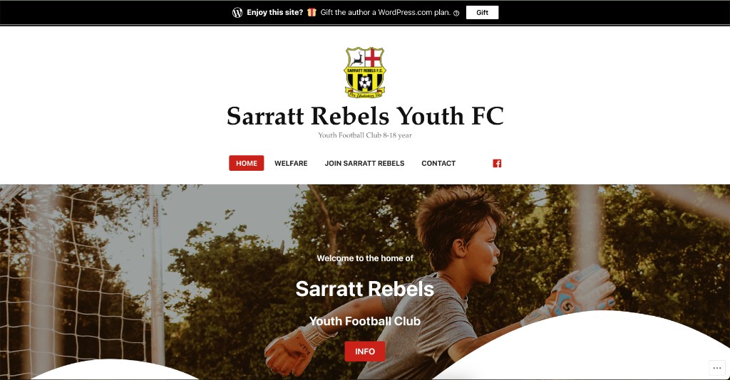
WordPress.com brochure. Crest, one photo, INFO.
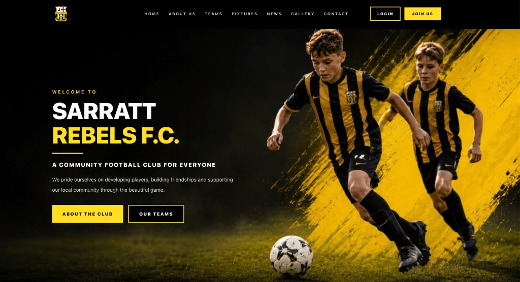
Club hub. Kit colours, Join Us, teams and fixtures in the nav.
What changed
The strip on the screen
Yellow and black are not decoration. They are the kit. The redesign puts them on the hero, the buttons, and the type, with players in the actual strip rather than a single cropped goalkeeper shot on a default banner.
Join Us, not INFO
A grassroots club lives on recruitment. The header now has Join Us beside Login. The hero has About the Club and Our Teams. A family can see the path without hunting an email in a paragraph.
A nav a club can grow into
Home, About, Teams, Fixtures, News, Gallery, Contact. That is how volunteers actually run a season — not three pages and a Facebook icon. Welfare and safeguarding stay; they no longer have to be the whole information architecture.
Status
Engagement
Website redesign
From a WordPress.com brochure to a grassroots club hub.
The takeaway
A youth club does not need a media-site. It needs to look like the team on a Sunday morning, and to answer the only question a new parent has: can my child join? The crest was always good. The site around it needed to catch up.
Need a site for a club, not a brochure?
I redesign websites for grassroots clubs and local organisations — kit-true branding, a join path, and pages volunteers can actually keep up to date.