Natural Footwear: a summer microsite that sells the fit, not the SKU

Natural Footwear already had the stock — Mephisto, Waldläufer, Naot — a high street shop in Temple Fortune, and steady organic search. The catalogue page did not help a customer choose. The engagement is digital growth strategist: ship a summer campaign microsite at summer.natural-footwear.com, then use it to lift how the main shop presents fit, fastening, and conversion.
The client
Naot Natural Footwear is a family-run shop that has spent more than twenty-five years choosing European and Israeli comfort brands. They sell from a high street store at 1029 Finchley Road, Temple Fortune, and ship worldwide. The line is comfort first — shoes made to the natural shape of the foot, often with removable cork orthopaedic footbeds, selected with podiatry in mind — without giving up fashion.
That is a specialist proposition. Customers come for wide fittings, lace-and-zip trainers, bunion-friendly panels, and the chance to try shoes on unhurried. The website had to start sounding like that, instead of like a generic product grid with a red campaign banner on top.
The challenge
The live summer collection is a WooCommerce archive: five products in a row, long SKU titles, a price, and a “Select options” button. Fit — the reason someone shops here — is buried in the product name. Waldläufer H-Teresa in jean blue and taupe look like two separate listings. Mephisto Niro appears twice in different colours with no way to compare size or fastening on the card.
A full-site redesign on a catalogue of 750+ styles is the wrong first move. The brief was a campaign microsite: take the summer walkers, present them the way the shop talks about them, and prove the pattern before rolling it onto the main store.
- • Lead with the buying reason — wide fit, fastening, cushioning — not the manufacturer code
- • Put colour and size on the card so the customer can choose without opening every product
- • Keep the family-run brand: curated, not a marketplace
- • Ship it as a microsite so the owners can try it and refine it before it replaces the live shop
Before and after
The main shop lists shoes. The live microsite helps someone pick a wide-fit trainer.
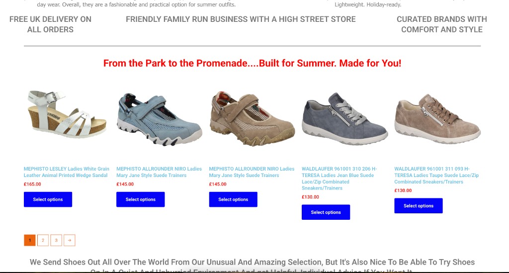
Live catalogue. SKU titles, prices, and a generic CTA.
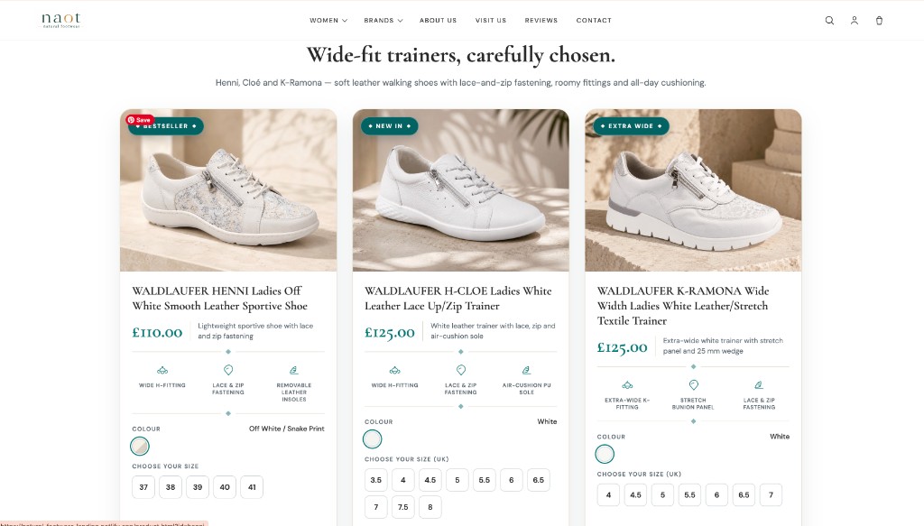
Live at summer.natural-footwear.com. Fit, colour, and size on the card.
What the microsite changes
A collection headline, not a banner
“From the Park to the Promenade” is a campaign line. The microsite leads with “Shoes that love you back” and names Henni, Cloé and K-Ramona up front: soft leather, lace-and-zip, average H or wider K fittings, all-day cushioning.
Fit as a first-class field
Each card carries badges and icons the shop already uses in conversation: wide H-fitting, extra-wide K-fitting, lace and zip, removable leather insoles, stretch bunion panel, air-cushion sole. That information used to live inside a 20-word product title. Now it is scannable.
Colour and size before the click
The live grid sends every visitor to a product page to discover whether their size exists. The microsite puts colour swatches and UK size buttons on the card. Fewer dead-end clicks; closer to how the high street counter actually works.
A landing page, not just a grid
The live site adds a comparison table, Google reviews, a size guide, delivery and returns, and a Temple Fortune visit block. It sells the three styles as a decision, then sends people to the shop — or into the store at 1029 Finchley Road.
Prove it on a microsite first
The main shop has hundreds of styles. Replacing that layout in one go would be a bet. Shipping the summer edit to its own subdomain lets the owners try the pattern, then refine it before it becomes the store template.
Status
Project status
Completed
Summer microsite live at summer.natural-footwear.com. Main catalogue remains at natural-footwear.com.
Engagement
Digital growth strategist
Campaign microsite as the first move — then convert, content, and catalogue work on the main shop.
Organic search, today
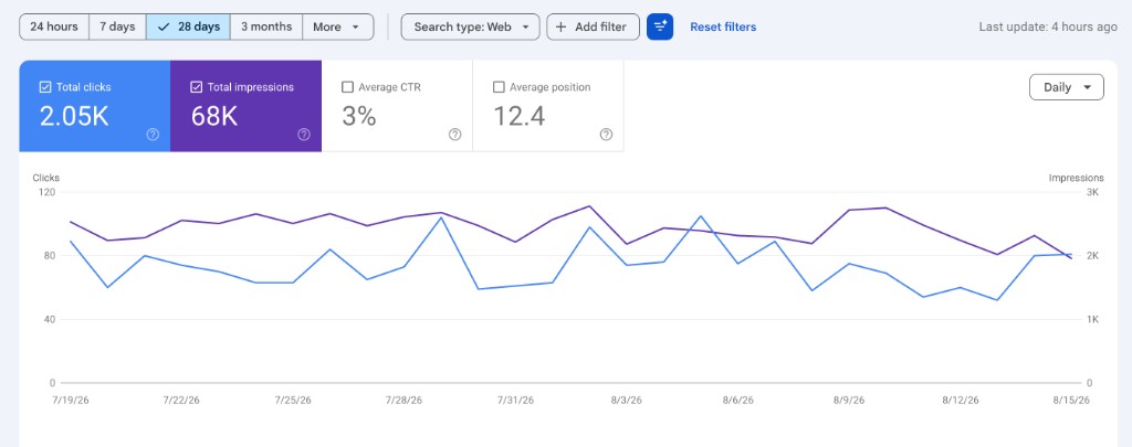
Search Console for the main shop over 28 days (19 July–15 August 2026). This is the baseline the growth work sits on — not a claim that the microsite already moved these numbers.
Clicks
Impressions
Average CTR
Average position
What the owners said
“Nicole and I have been looking at your proposed microsite for the summer campaign. Firstly, the redesign looks great, a real step up from the current design. Trying it out and refining it on a microsite is a good idea too.”
The takeaway
A specialist shop does not need a louder banner. It needs the buying criteria on the page: fit, fastening, colour, size. A campaign microsite is how you test that without betting the whole catalogue. The owners agreed — the redesign is a step up — and it is now live at summer.natural-footwear.com.
Need a campaign site that actually helps people buy?
I build WooCommerce and WordPress shops for specialist retailers — clearer product cards, seasonal microsites, and catalogue work that matches how the counter already sells.