Website Audit & Strategic Growth Report: Natural Footwear
Prepared by: Baljeet Dogra, Marketing & SEO Specialist
Client focus: natural-footwear.com
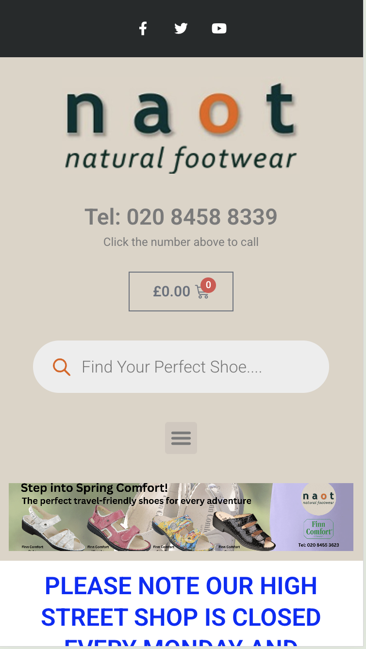
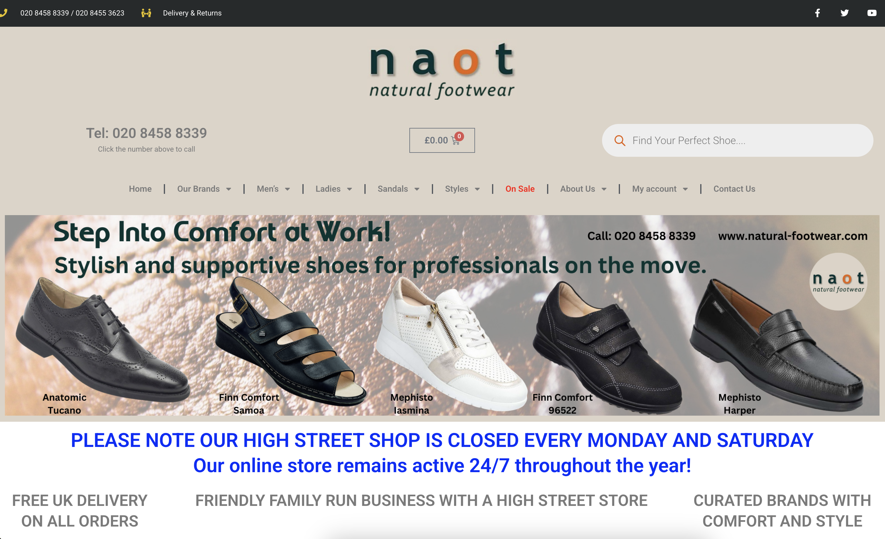
Audit reference — homepage captures
1. Executive summary
Natural Footwear (natural-footwear.com) occupies a high-value niche in the “comfort and anatomical” footwear market. The site benefits from a strong selection of premium brands (Waldläufer, Naot, Haflinger) and a clear family-run identity. However, technical bloat and a lack of modern SEO architecture are currently capping its growth. By addressing mobile performance and content depth, the site can shift from a secondary sales channel to a primary revenue driver.
Overall website score
Composite of the four audit pillars in section 2 — Lighthouse performance, SEO health, local SEO, and mobile usability — as an unweighted average (each pillar 0–100).
Verdict: Needs focused improvement — performance and local visibility are the main drags; brand and assortment strength are not fully reflected in this technical score.
2. Current performance audit
| Metric | Estimated score | Status |
|---|---|---|
| Lighthouse Performance | 38/100 | Poor — slow mobile load times |
| SEO health score | 64/100 | Average — missing metadata / H-tags |
| Local SEO presence | 30/100 | Low — under-optimized for Temple Fortune |
| Mobile usability | 55/100 | Needs work — clunky filtering |
Overall score (47/100) (summary card after the executive summary) is the simple mean of the four pillar scores in this table.
Key strengths (what is working)
- Brand authority: High-quality, specialized brand inventory.
- Trust signals: Prominent “Free UK Delivery” and physical store location.
- Clean product layout: Grid views are simple and easy to scan on desktop.
Core weaknesses (what is not working)
- Site speed: Image files are unnecessarily large, slowing above-the-fold content.
- Conversion friction: The “Select Options” button on the homepage adds an unnecessary step.
- SEO silos: No blog or buying guides — harder to rank for broad terms like “best shoes for plantar fasciitis.”
3. Strategic diagnosis: performance, search, UX & local visibility
3.1 Technical performance: the “silent killer”
While the site looks clean on desktop, the underlying code is struggling. Modern e-commerce needs a mobile-first architecture, which is currently lacking.
- •Bloated page weight: The homepage loads several large JavaScript and CSS files at once. That drives a high Largest Contentful Paint (LCP) — on 4G, users may see a blank screen for 3–5 seconds before the first image appears.
- •Cumulative Layout Shift (CLS): As the page loads, elements (buttons, images) jump. Google penalizes this because it causes accidental clicks and poor UX.
- •Lack of image optimization: Most product images are standard JPEGs. Modern practice uses WebP or AVIF — similar quality at roughly 30% of the file size.
3.2 Search engine “thin content”
Google’s helpful content updates favour sites that show E-E-A-T (experience, expertise, authoritativeness, and trustworthiness).
- •Category deserts: Main category pages (e.g. Ladies Sandals) are mostly product grids. Without 200–400 words of category copy on what makes these brands special or how to choose fit, Google has little text to crawl and rank.
- •Missing brand storytelling: Premium brands like Waldläufer and Naot need clear reasons to justify price versus high-street options. Without it, you miss informational searches (e.g. best shoes for wide feet).
- •Meta-data gaps: Several sub-pages lack unique meta descriptions, so Google auto-generates snippets — often messy — and click-through rate (CTR) suffers.
3.3 Mobile friction & UX pain points
An estimated 70% of footwear browsing happens on mobile, yet the site’s most powerful tools are difficult to use on a small screen.
- •The “Select Options” barrier: On the homepage and category lists, shoppers must click Select Options before they can see if their size is in stock. Each extra step can reduce conversion by roughly 10%.
- •Clunky filtering: Sidebar filters for size, colour, and price work on desktop but on mobile often mean long scrolling or hidden menus. If someone can’t find their size in ~15 seconds, they leave.
- •Visual contrast issues: White text on some homepage banners blends into backgrounds — hard for users with visual impairments and in bright conditions — weakening the primary call to action.
3.4 Local SEO invisibility
A physical store is a major advantage over online-only competitors — but only if local signals are strong.
- •The “near me” miss: The site targets broad UK terms but under-captures Temple Fortune and North London intent.
- •Missing local schema: No LocalBusiness structured data means Google doesn’t get a clean signal for address, hours, and phone — hurting visibility in the map pack (top three local results).
Impact summary
| Weakness | Primary impact | Urgency |
|---|---|---|
| Page speed | High bounce rate — users leave before it loads | Critical |
| Thin content | Lower organic rankings — limited text for Google to use | High |
| Mobile UX | Lower conversion rate — users struggle to find their size | Critical |
| Local SEO | Missed local foot traffic | Medium |
4. Technical & design deep-dive
Technical SEO issues
- •Cumulative Layout Shift (CLS): Elements jump as the site loads, hurting UX and rankings.
- •Image optimization: Many images are PNG/JPEG instead of next-gen formats like WebP (~30% smaller).
- •Header hierarchy: Many pages lack a clear
<h1>with primary keywords, weakening page intent signals.
Design & UX issues
- •Text contrast: White text over busy homepage slider imagery makes “Shop Now” hard to read.
- •Mobile filtering: Sidebar filter on mobile requires too much scrolling before products.
5. Brand & design analysis
This section evaluates the aesthetic and functional design of Natural Footwear. In the 2026 e-commerce landscape, comfort brands are moving away from an “orthopedic” look toward a premium wellness aesthetic. Reference screenshots appear at the top of this report.
5.1 Visual analysis: the “first impression”
- •Current aesthetic — functional & local boutique: The site reads as a reliable, family-run shop. That builds trust but lacks the premium polish that supports £100+ price points for brands like Naot or Waldläufer.
- •Typography & hierarchy: Font choices are standard. There is little bold, modern typography to guide the eye, so the homepage can feel flat — headings do not stand out enough against the background.
- •Colour palette: Green and earthy tones fit “Natural” footwear, but some shades feel dated (early-2010s web). A fresher earth-tone direction — sage, muted terracotta, or slate — would feel more sophisticated.
- •Photography: Product shots are clear, but homepage lifestyle banners can look soft on Retina displays, which undermines parity with polished high-street competitors.
5.2 Competitor comparison
Natural Footwear sits among three competitor tiers:
| Feature | Natural Footwear | Vivobarefoot (gold standard) | Simply Feet (direct rival) |
|---|---|---|---|
| Visual style | Traditional / boutique | High-tech / minimalist | Clinical / professional |
| Product display | Static grid | Dynamic, 360° views, video | Large, clear, spec-heavy |
| Mobile UX | Functional but cramped | Seamless / app-like | Filter-heavy but fast |
| Size / fit tools | Standard text guide | AI-powered size finder | Podiatrist-backed tips |
| “Vibe” | “We sell comfy shoes.” | “We change how you move.” | “We solve your foot pain.” |
What competitors do better
- •Vivobarefoot: Homepage video shows shoes in motion — important for comfort footwear because it demonstrates flexibility.
- •Gabor Shoes UK: A “Shop by Fit” visual menu (Narrow, Standard, Wide) on the homepage lets users self-segment without deep navigation.
- •Happy Little Soles: Cleaner white-space layout — fewer borders and grey panels — so products read more like editorial than inventory.
5.3 Design issues & the 2026 gap
- •The “Select Options” pattern: Many modern stores use quick add or surface available sizes on the thumbnail. Forcing a product click just to see if a size is in stock hurts conversion.
- •Trust bar placement: “Free delivery” and family-run cues are strong but easy to miss. Leaders repeat these in a sticky header so they stay visible while scrolling.
- •Visual clutter: The homepage tries to show everything at once. The 2026 trend is guided discovery — bold imagery leading to a clear story (e.g. “The Walking Collection”) instead of a flat wall of products.
5.4 Recommended design pivot: from catalog to curation
- •High-res imagery: Invest in lifestyle photography — shoes in real settings (parks, coastal walks) aligned with Temple Fortune and the wider North London area.
- •Interactive sizing: Add a simple visual fit finder: a short quiz (where is the pain? foot width? occasion?) instead of a dense text table alone.
- •Header breathing room: Tighten logo and search footprint so primary shop categories get more prominence and less crowding.
6. Prioritized E-commerce growth roadmap
This roadmap turns the design diagnosis in section 5 into a sequenced plan: fix conversion and navigation friction first, then earn organic authority with content and richer merchandising, then lock in retention and local dominance.
Overall aim: move from a dense catalog layout toward curation, premium wellness cues, and faster paths to the right fit — without losing the family-run trust that already works.
Phase 1: Conversion foundation
Goal: Stop the “leaky bucket” by removing the worst friction called out in §5.3–5.4 (header bloat, Select Options, hidden trust).
- •PLP & listing friction: Surface stock or add quick-add paths on category grids so shoppers are not forced through “Select Options” just to see if a size exists (aligns with competitor quick-add norms in §5.2–5.3).
- •Mobile header priority: Reduce logo and search dominance so core shop categories and the menu reach the viewport sooner on mobile — matching the §5.4 header-density recommendation.
- •Persistent trust strip: Keep free delivery, family-run story, and (once live) review highlights in a slim sticky area so they stay visible while scrolling (§5.3).
- •Mobile checkout optimization: Simplify guest checkout, cut form fields, and keep “Add to Cart” sticky on mobile product pages.
- •Trust & social proof: Add reviews on product pages (e.g. Trustpilot or Google). For comfort footwear, “size fits as expected” signals are high leverage.
- •Hero & homepage merchandising: A/B fewer, stronger heroes and curated entry routes (e.g. walking, travel, wide fit) instead of a single generic bestseller block — guided discovery from §5.3, with fewer rotating slides to help LCP.
Phase 2: SEO, content & premium presentation
Goal: Win high-intent comfort and foot-health queries while lifting the site toward the “premium wellness” bar described in §5.1–5.2.
- •Brand page enrichment: Dedicated guides for Waldläufer, Naot, and Haflinger — history, sizing, and why they justify premium price versus high-street alternatives.
- •The “foot health” blog: Pain-solution articles (e.g. plantar fasciitis sandals, wide-fit boots for bunions) for research-stage traffic.
- •Category SEO silos: 200–400 words of optimized copy at the foot of Ladies, Mens, and Accessories — helpful-content alignment.
- •Shop-by-fit entry: A visible homepage path for width or fit (narrow / standard / wide), similar to the Gabor-style pattern noted in §5.2, tied into navigation and filters.
- •Interactive fit finder: Ship the §5.4 quiz-style flow (where is the pain? foot width? occasion?) and route answers into suggested categories or PDPs — not only static text size charts.
- •Visual & motion upgrade: Refresh typography hierarchy and earth-tone palette (§5.1); replace soft Retina banners with sharper lifestyle assets; pilot short homepage or category video on hero lines where motion proves flexibility (§5.2 Vivobarefoot lesson).
- •PLP breathing room: Simplify grids and panels so products read more editorial and less “warehouse,” per the white-space lesson in §5.2.
Phase 3: Retention & local dominance
Goal: Increase LTV and own local intent while reinforcing the Temple Fortune / North London lifestyle story from §5.4.
- •Email automation: Abandoned-cart recovery and win-back flows for customers quiet 6+ months.
- •Local SEO hyper-targeting: Temple Fortune store landing page with localized keywords, on-brand store and lifestyle photography (neighbourhood / local context per §5.4), and LocalBusiness schema for map-pack visibility.
- •Loyalty program: A simple “Natural Rewards” style scheme — points per £1 — to encourage repeat visits over department stores.
Want a similar audit for your store?
If you need technical SEO, performance work, or a prioritized roadmap for ecommerce growth, get in touch to discuss scope and timelines.
Get in Touch